Build a diversified portfolio
How might we create an experience which not only provides enough information for an investor to make a financial decision, but also educates on the differences between portfolio compositions
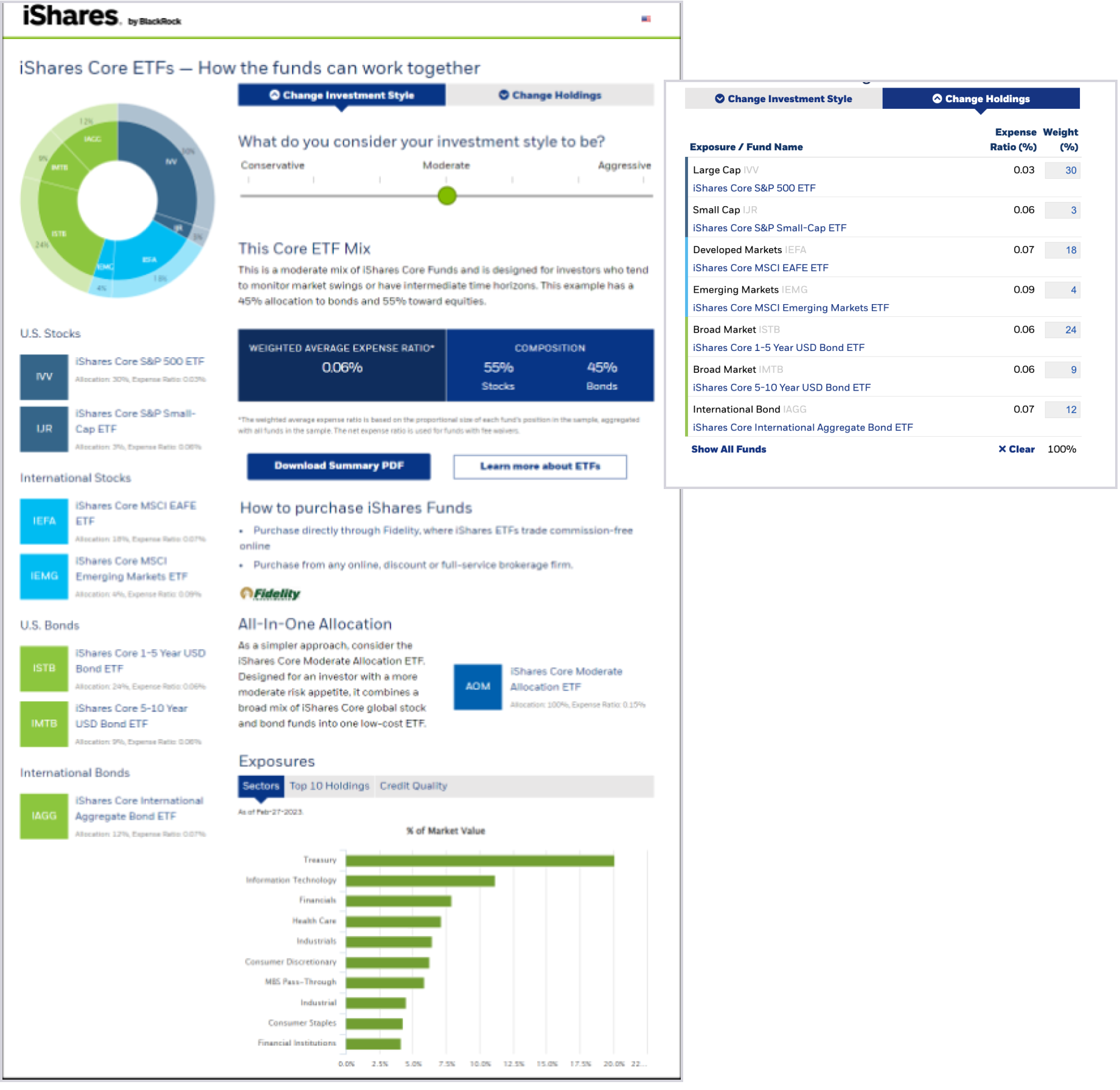
... but a Core portfolio builder already exists at BlackRock
True. However the tool is very limited and the company has rebranded since then. It is not also device responsive, nor is it accessible- so we saw this as a great opportunity to improve the experience while fully rebranding at the same time.
To uncover potential improvement areas, we ran some usability testing on the previous tool.
What works
- Gamified: the users love the interactivity of the slider and the response from the tool.
- Has the right amount of data for an investor to explore more, ultimately leading to a decision.
Opportunities
- How might we arganize the data in a way that is not scattered through the tool?
- Reduce redundancy: The same tickers appear in multiple positions.
- Clear next steps: How might we strategically position the next steps the is more discoverable for the user?
Let's set some goals
What do we want to accomplish by redesigning this tool?
For the user
- Increase engagement within the tool.
- Meet the user where they are: Organize the data in a way that makes sense and is discoverable.
- Don't make the tool worse.
For the business
- Increase engagement to the All in One allocation.
- Increase clicks to the tool.
- Increase engagement with next steps.
For my team
- Improve worklow and delivery process.
- Improve accessibility spec, testing and delivery.
- Increase team visibility within the firm.
Learning the business perspective
How might we learn more about what the business needs are? In order to find out, we conducted some internal interviews. Here is what we found:
- The business would like to give equal attention to the "All in One Allocation" Products.
- We don't expect an end investor to invest in an entire portfolio.
- If we can get users to explore one ETF that is a win.
- We would like users to engage with the next steps.
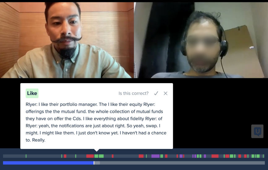
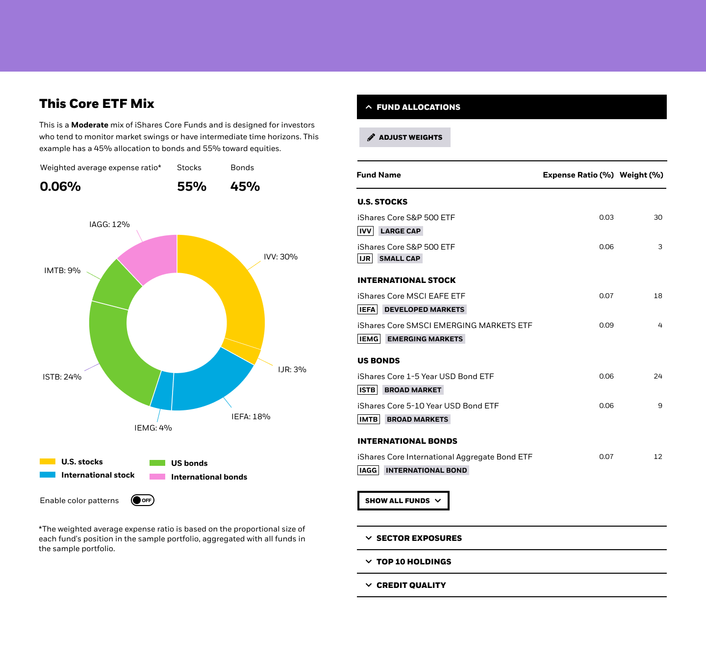
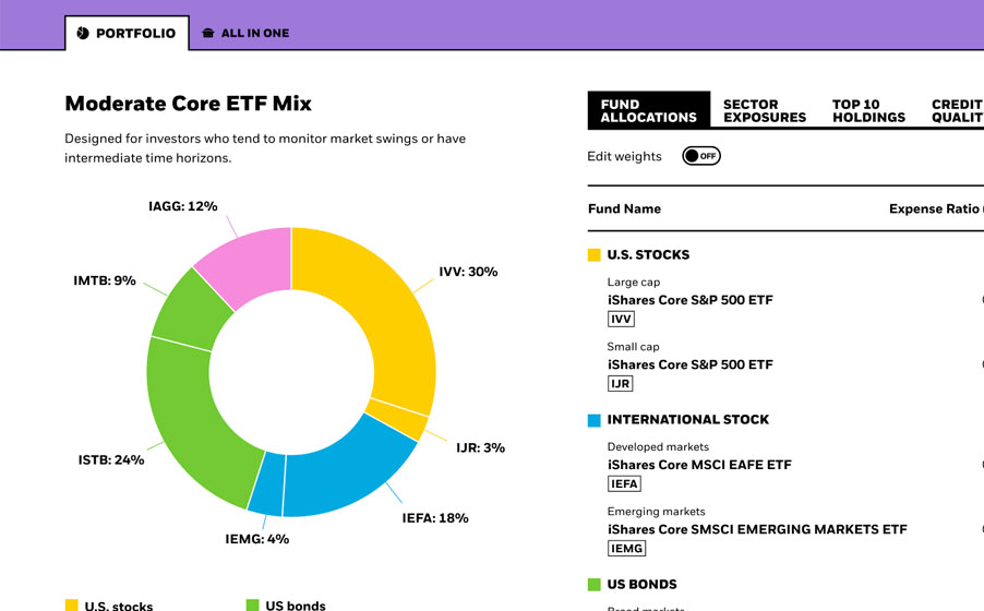
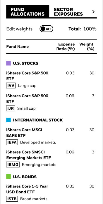
It's not obvious there is more data than Expense Ratio
-Brad Zucker"Core ETF Mix" means nothing to the end investor
-Sophia Maxstadt
How we envision the customer journey
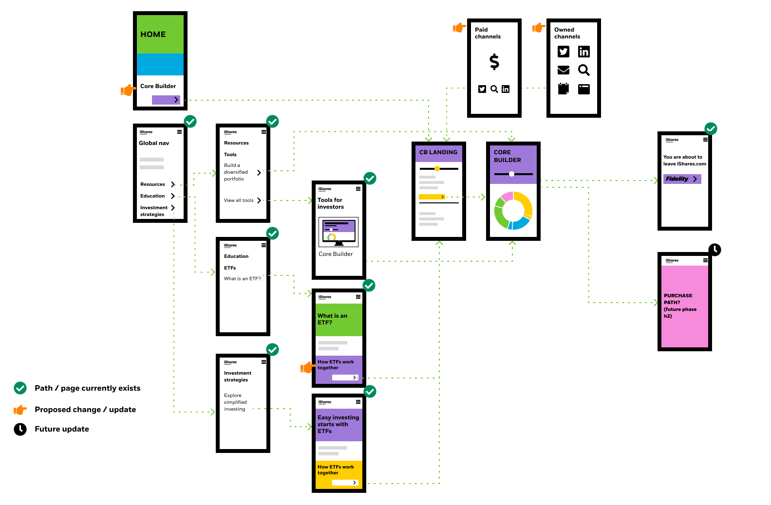
How would a user get to this tool? We considered multiple entry points, from the pages within the site and social media.
There are many paths a user can take with lots of disclaimers along the way, so mapping out that journey would be helpful to inform designs.
Finding the user perspective
We put together a few strategies to learn more about how the users feel and behave with similar tools.
Strategy: talk to users directly
We asked users about their portfolio research and building habits as well as their expectations, and what resources they regularly use.
Key insights
- Users usually have multiple tabs or tools open when doing their research.
- Brand credibility plays a large role.
- Don't put information behind a paywall.
- They love data visualizations.
Strategy: Usability testing
We had a lot of ideas to put in front of users to put in front of users. Their feedback and insights really informed the next iterations and MVP
Prototype: Content organization
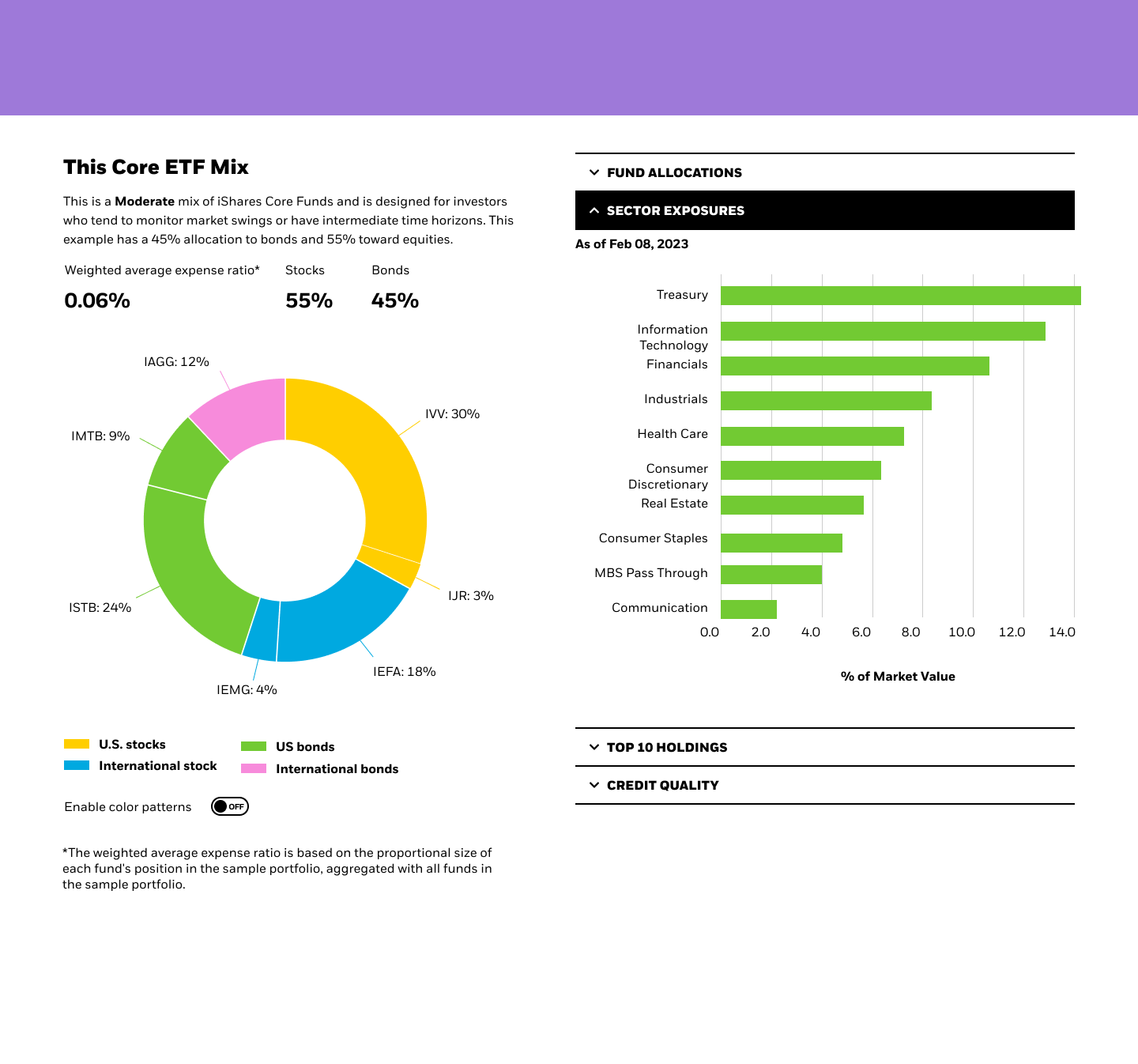
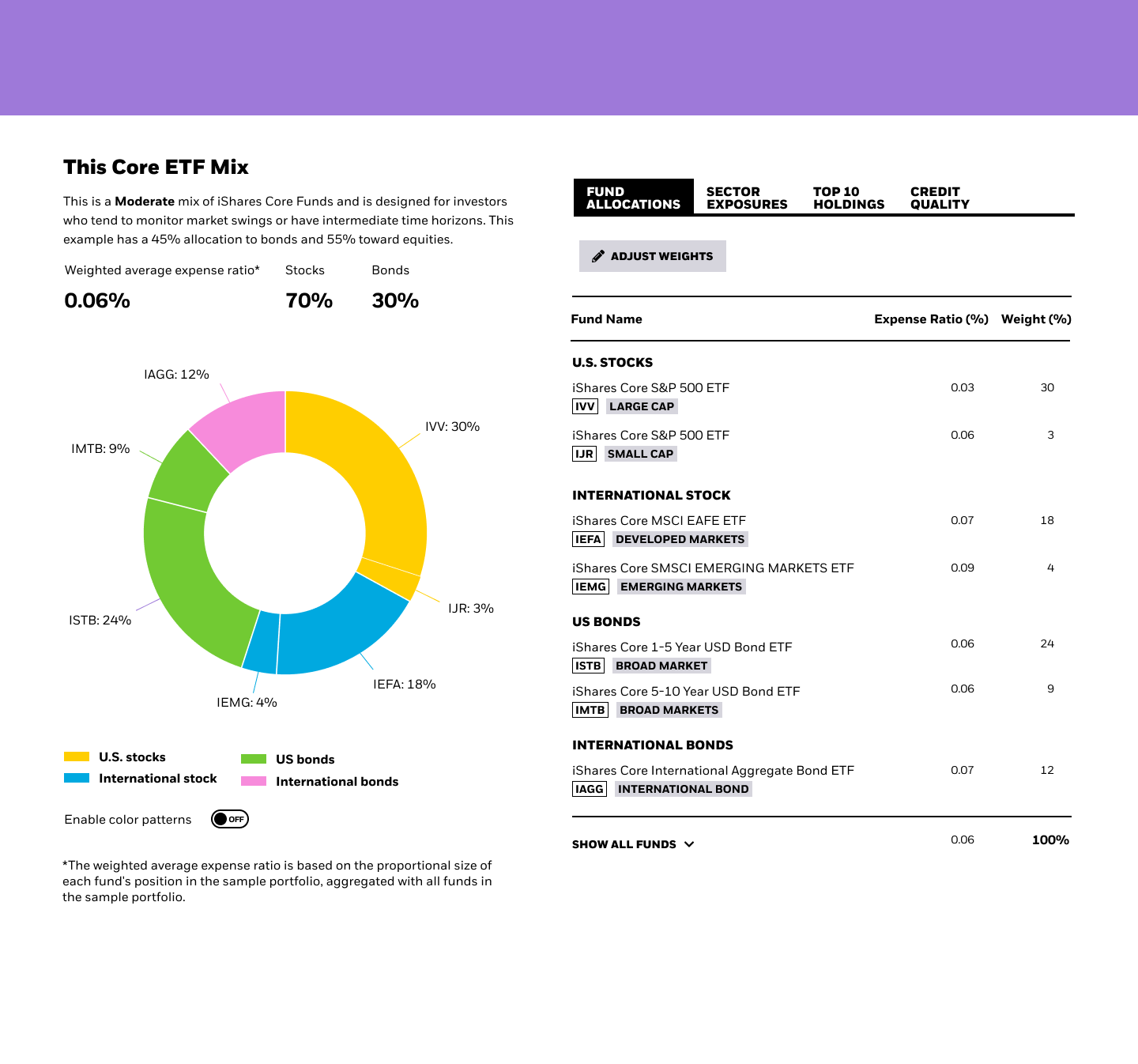
Hypothesis: We believe the content organization causes users to miss some key actions. How might we present all the data and content in a way that is easily discoverable and not redundant?
Business view: The data displayed is all required by L&C. How can we serve it to users in a way that is intentional and valuable to their research?
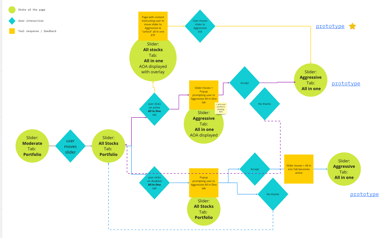
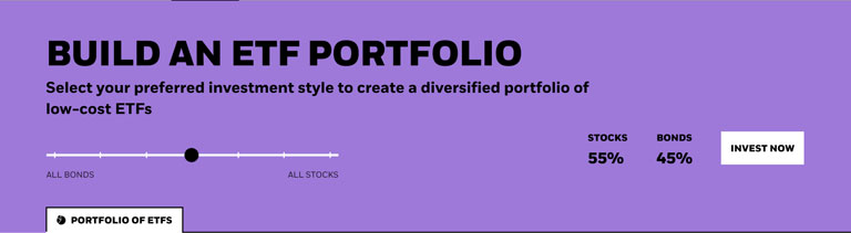
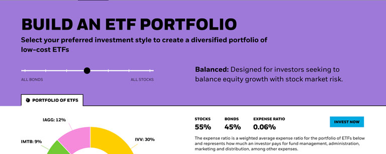
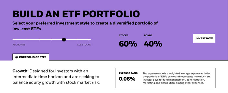
Prototype: Add context to the Slider
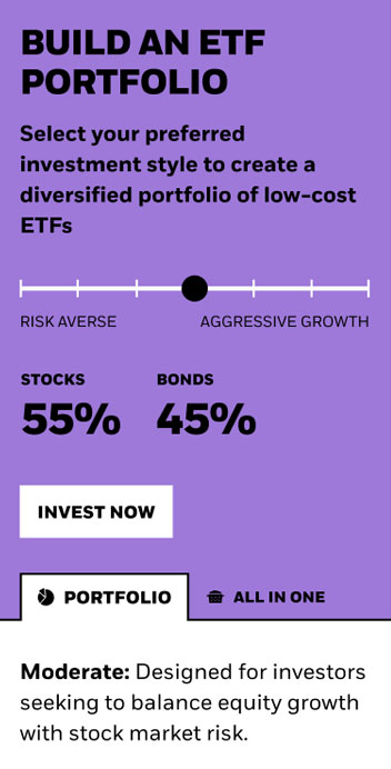
Hypothesis: We believe users need more information about what the slider represents. Since this is the main driver of the tool, how might we provide context to the slider so the user can recognize the differences between investment styles?
Business view: The slider represents the user investment style- from very conservative to very aggressive. How do we make sure users are aware of this?

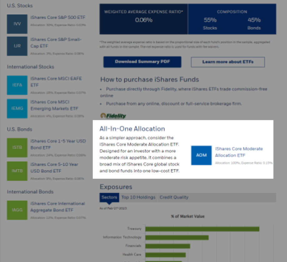
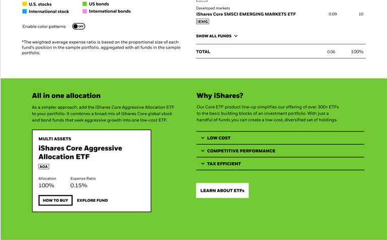
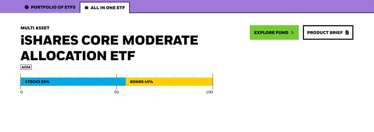
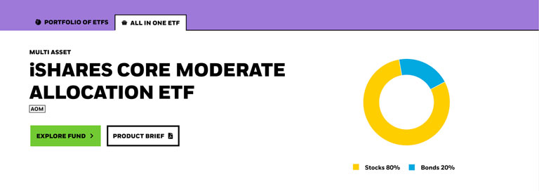
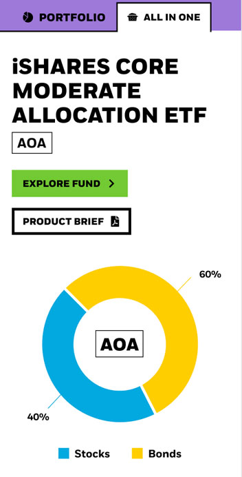
Prototype: All in One allocation offering
Hypothesis: We believe users are not valuing the all in One allocation offering as much as the portfolio. How might we bring equal attention to the All in One offering?
Business view: The all in one allocation product is an alternative to the portfolio which requires less maintenance but higher in cost.
Takeaways / Recommended MVP
Tabs make it easier to navigate with less scrolling up and down
- Usertesting.com user
Seems like the information is taylored if I move the slider back and forth
- Usertesting.com user
I take it as an alternative to building my own
- Usertesting.com user

5/6 users found the next step action more discoverable than the previous version
What we learned overall
Design Principles
- Maintain interactivity and tool response
- Clear next steps
- Optimized for mobile
- Enough context that doesn't disrupt
Challenges
- Tow the fine line of not giving financial advice
- Maintaining simplicity with data
- Differentiating this tool from all the other ones within the iShares tool suite
As a global team
- Regular design-dev sessions keeps the product team on the same page
- Test accessibility early
- Collaboration across UX initiatives contributes to firmwide adoption
Getting the word out
We wanted to share this tool with the world, starting with our offices. I created a promo video using Figma transitions and uploaded it to all major BlackRock offices in the US amd EMEA. (SF, NY, ATL, LDN, BUD)
Business impact
How we measured success of the Core Builder once it was launched to the public.
Stats
July 2023 - Jan 2024 stats, compared to the 2022 year
- +37% Daily page visits
- 6% How to Buy conversion, previous =.57%
- +3% All in One engagement
Raising the bar
This was the first tool on BlackRock.com within the iShares digital ecosystem built with Accessibility as part of the process from start to finish.
This is one of the best in industry, in terms of data visualization
- Irfan Ali, W3C Invited Expert, Digital Accessibility Program Manager at BlackRock
Contributing to the Design System
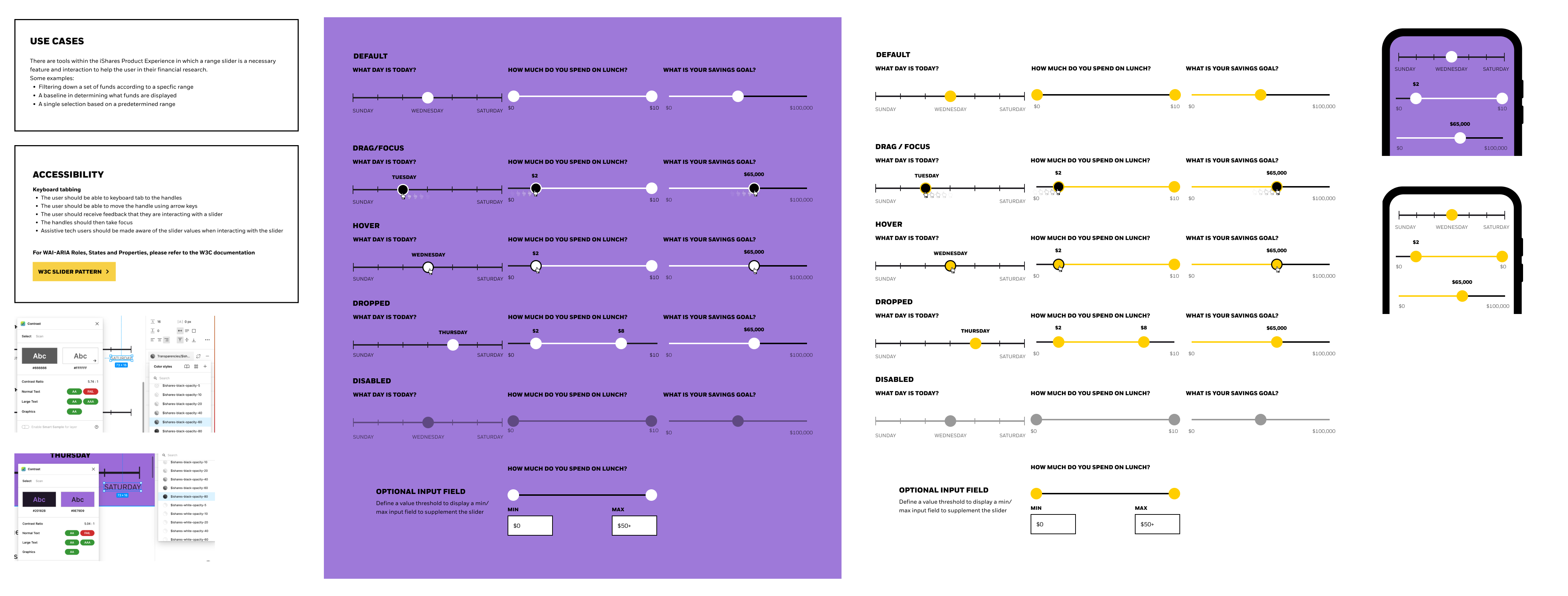
Our Design System was still in its early phases, and there was no documentation for a slider. Since the Core Builder relied heavily on a slider for its core functionality, this was a perfect oppurtunity to identify all other use cases and contribute to the Design System.
Processes and Technical Stuff
Duration: 10 sprints
Spec delivery
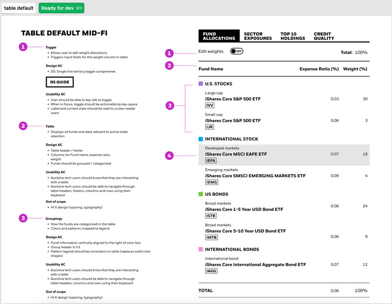
I worked with devs to create a framework for delivering specs, including defining acceptance criteria for usability and accessibilty. Figma's "Dev mode" also helped in improving this process.
Mid-fi:
- Specify pattern, component or solution
- Define anatomy, or link to Design System spec if available
- Define usability acceptance criteria, including accessibility guidelines. Link to W3C pattern librarywhen possible.
Hi-fi:
- Pixel perfect positioning
- Responsive behavior and breakpoints
Structure
- 1 Designer (SF)
- One Project Manager (SF)
- Four Developers (BUD)
- Leadership (SF, BUD, LDN)
Workflow
- Agile workflow
- Lo/mid/hi-fi iterations
- Designers QA (if none available)
- Demo to stakeholders
- Retrospective
Tools
- Figma
- Usertesting.com
Management & organization
- JIRA
- Airtable
- Miro