Not everyone is an expert in finance
Some people can navigate investment products by looking only at specific data. Many others don't know where to start. How might we provide a tool which leads users to ETFs using financial goals rather than hard data as a vehicle, and in the process learn the benefits of ETF investing and taking the next steps to making a decision?
Let's understand our users
- How do we learn more about our user's financial decision making process?
- What are their expectations and behaviors?
- Most importantly, what are their goals?
Initial Research Plan
- 6 User interviews with end investors
- 3 sales interviews
- Look at stats for any relevant search terms / page visits
Undertsanding our users: Key takeaways
Key insights which helped us better understand user behaviors and expectations, and establish a base for design decisions as well as discovering problems.
What we learned
- It’s easy to lose trust
- Users utilize many tools at once
- Data should be easy to find
- Extra context always helps
- Would love ability to compare
- The Product Screener has the highest traffic of all tools, but high exit rate
Discovery: Competitive analysis
We looked at other services which directly or indirectly provided users a product based on specific goals or outcomes.
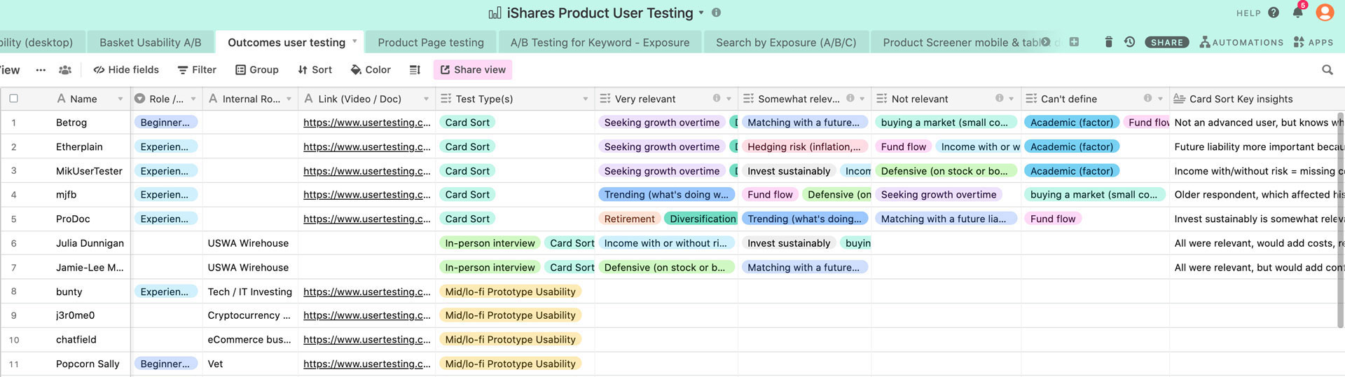
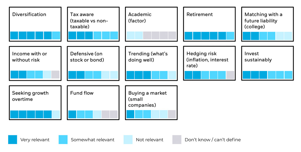
Understanding user and business needs
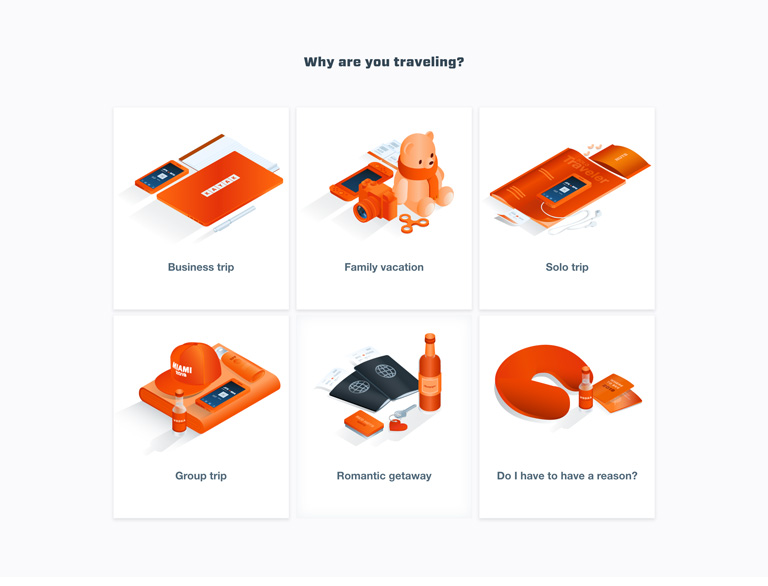
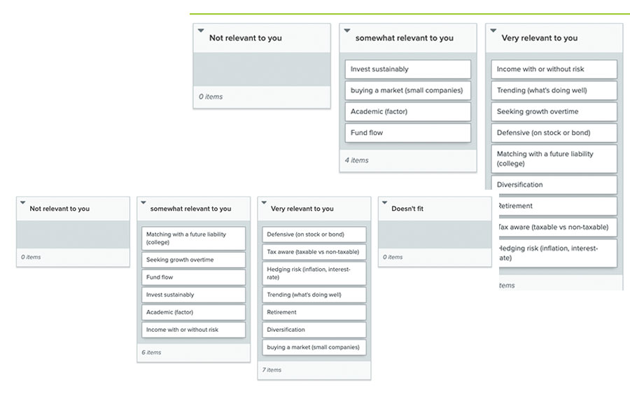
The business had their own idea of the definition of "outcome," as did the users we tested. In order to solidify what outcomes are, we put together card sorting exercises in front of users. We had the users sort the outcomes by personal relevance, and noting the outcomes users found confusing. We started off with 13 outcomes and were able to slim it down to five based on insights from the card sorting.
Insights
- This tool would appeal to more "mid-level" investors
- Some advisors would find this tool useful, mostly with new clients
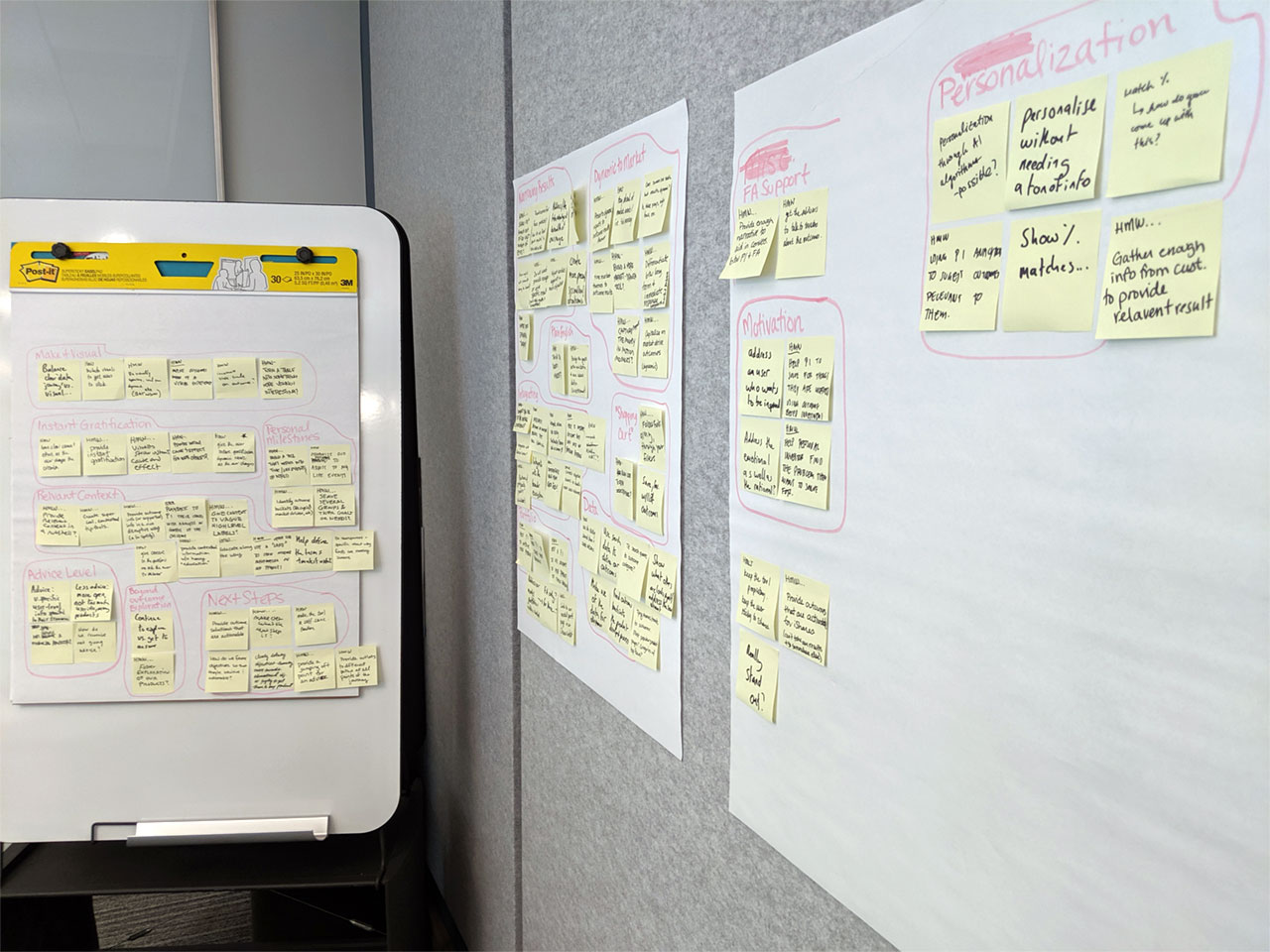
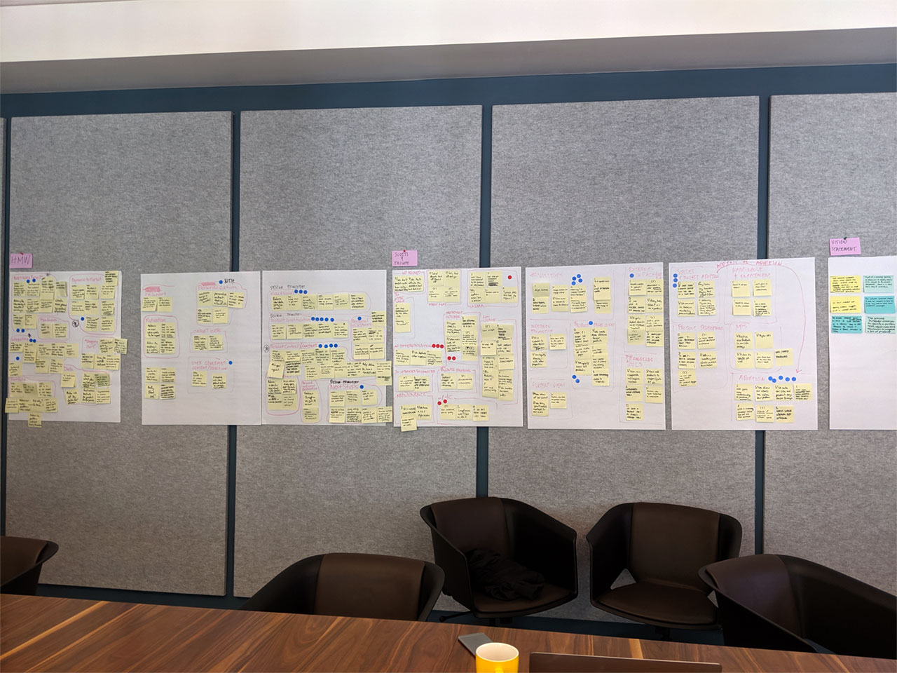
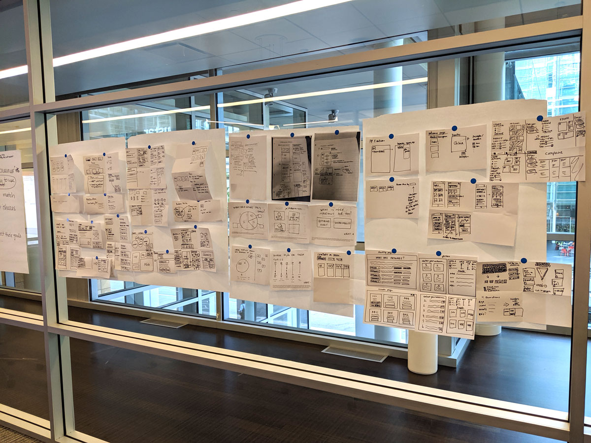
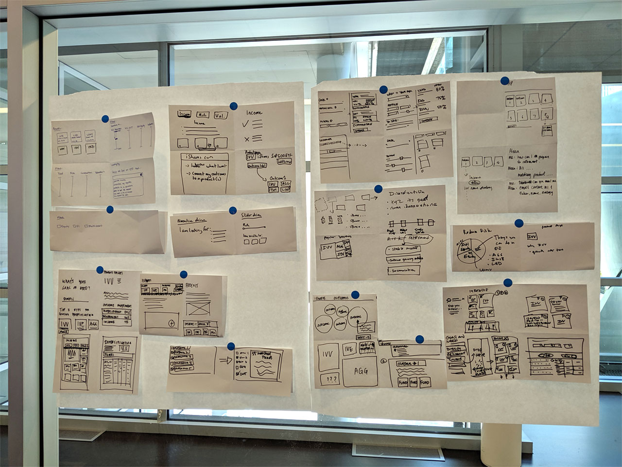
Discovery: Design sprint
We went through a Design Sprint to explore and discover how this tool can live in the real world. We were creating a brand new tool initially based off assumptions from feedback, so we needed to materialize and validate solutions. To accomplish this, we took four Designers, two project managers, one developer, and two fund managers, and locked them in a room for a week to figure it out.
For the user
- What defines goals or outcomes?
- Do our assumptions make sense?
- Where does this tool fit in the user journey?
- What data holds more weight in decision making?
- Direct and indirect competitor tools
For the business
- Leverage the new Brand VI
- Document patterns to be added to Design System in progress
- Bring in the right tone of voice for messaging
- Which funds would be most relevant for users?
- How do fulfill a need without recommending?
HMW's
- How might we use data and contextual info to tell a story?
- How might we create awareness and value for this tool?
- How might we differentiate this tool from others within the digital ecosystem?
- How might we measure success?
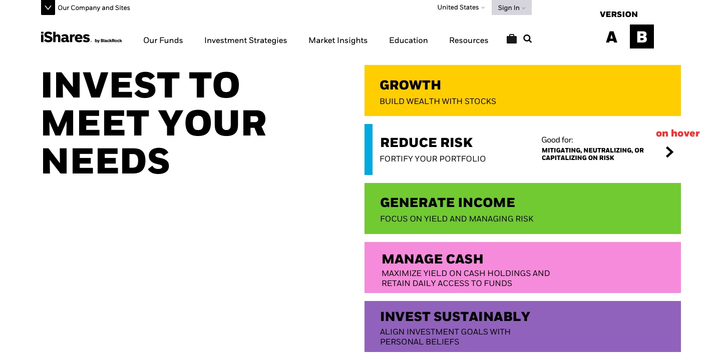
Deciding on "Outcomes"
We conducted multiple tests, including interviews and card sort exercises to narrow down and define what outcomes are and how users perceive them. These tests helped us find solutions for language, messaging, perceived value, and expected behavior.
Insights
- Branded outcomes came off too "salesie" and turned users off
- Jargon and buzzwords left negative impressions with older users
- Outcome titles needed a personal touch to the messaging
- Outcomes needed support (context) to effectively communicate value
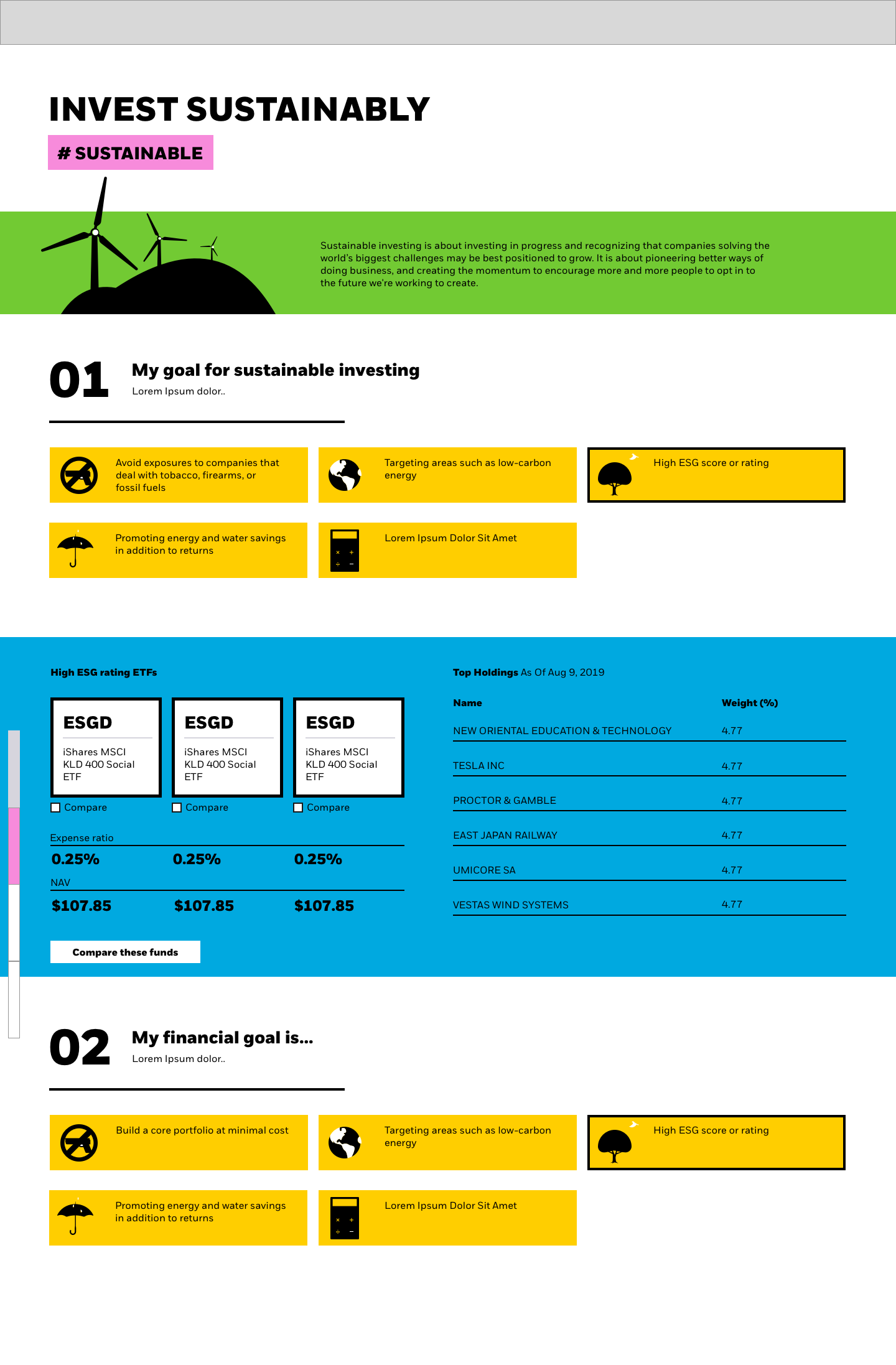
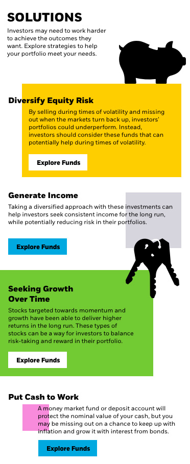
MVP
The minimum features needed to be usable enough to receive valuable user feedback and gain insight through analytics.
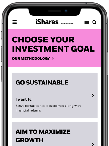
Defined goals or outcomes
- Understandable for novice investors
- Just enough to not overwhelm the user
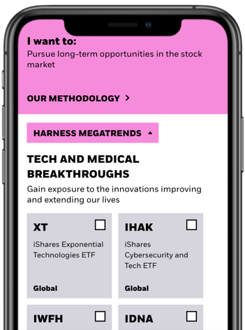
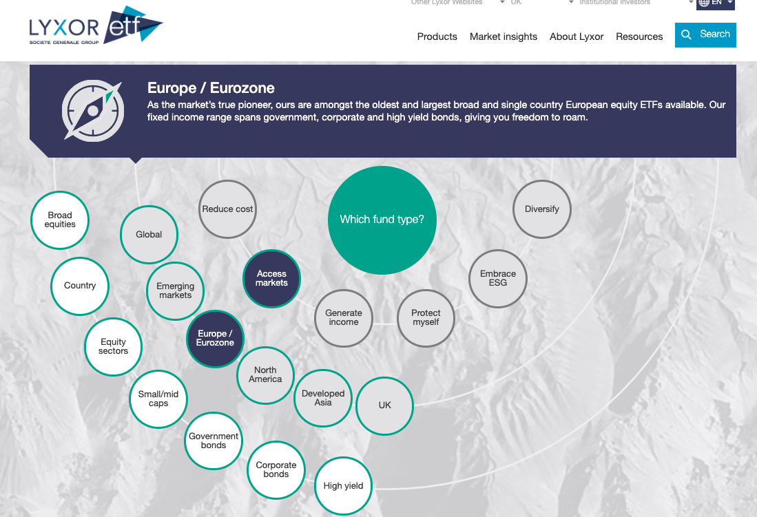
Display relevant ETFs
- Show four most relevant ETFs
- Only show most important data, not all
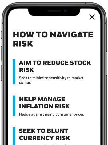
Provide context
- Provide contextual information to keep users on track
- Context should help user tell a story
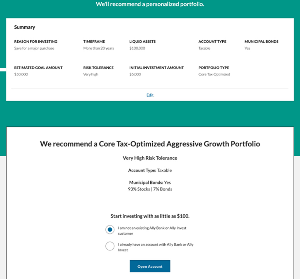
Next steps
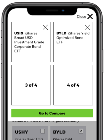
- Give user ability to explore further
- Connect to Product Pages or Comparison tool
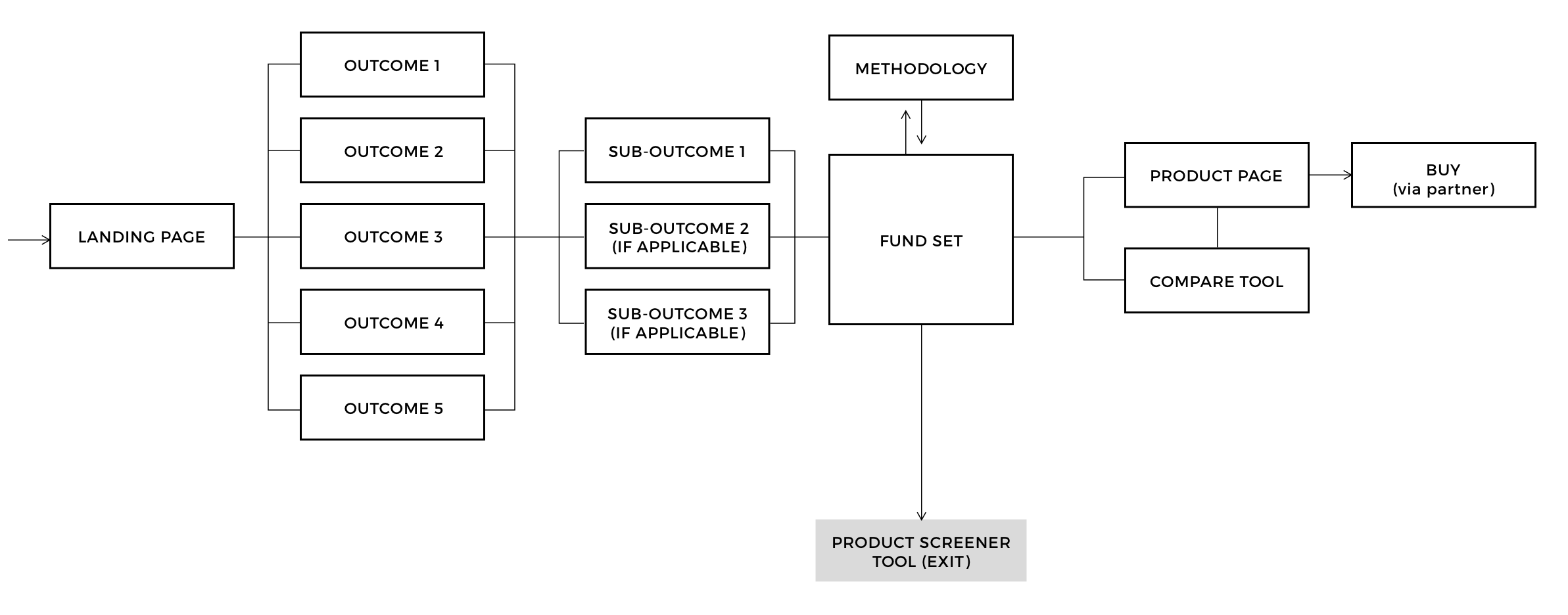
End to end user flow
Based on interviews and testing, we found that a landing page was helpful in creating a first impression and providing context to the tool. This tool may not be for everybody, so we set up an exit point to access our entire product screener. Sub-outcomes also added context to the journey and reduces cognitive load. We also discovered that the user's next step would be either to select and compare funds, or select a single fund to explore further.
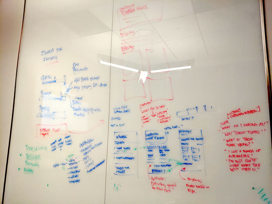
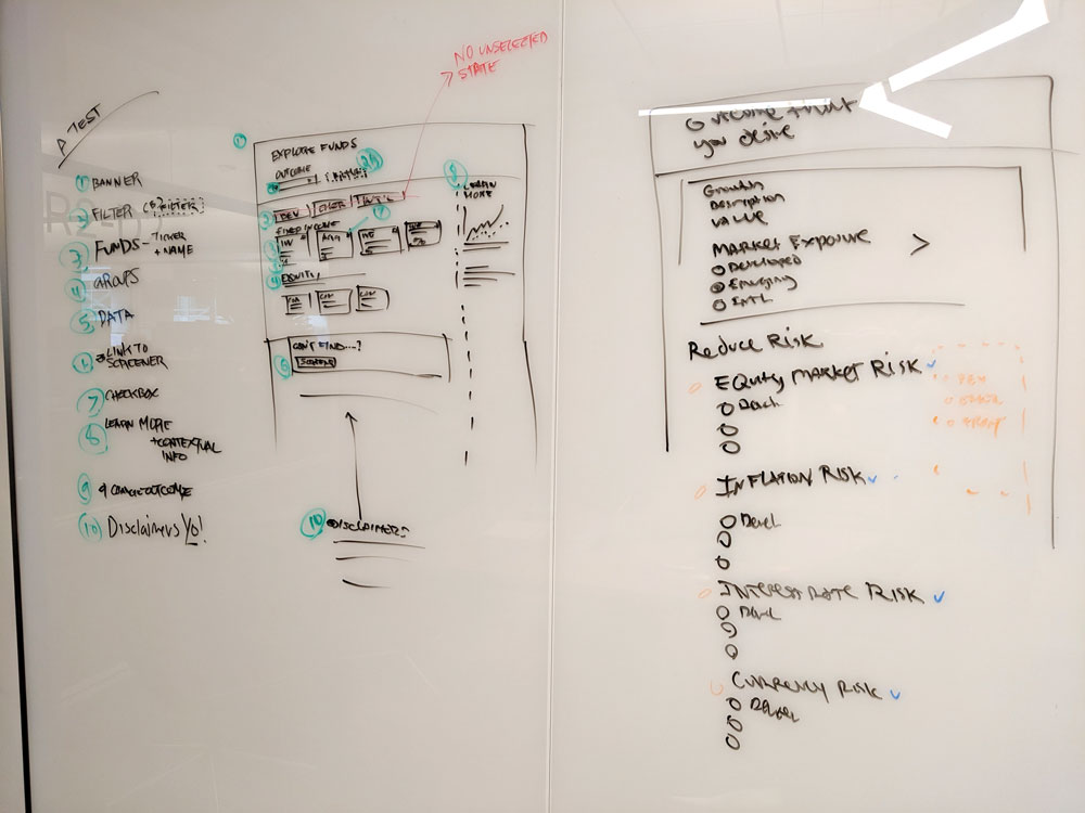
Design iterations & Usability testing
It seemed like there were a million ways to approach the UI, so the design team grabbed a white board and went to work every step of the way. We sketched out a few ideas and created lo/mid fidelity prototypes to test. We repeated this cycle for every major interaction within the journey.
What We Tested
- Entry point within the broad site experience
- Discoverability of the different outcomes
- Data and content consumption
- Users' next steps
What we found
- A landing page/screen was helpful to setup the experience
- An interstitial screen on mobile between the landing and fund screens increases the tool's value dramatically
- One piece of relevant data was helpful to understanding the funds
- Strategically placed contextual information decreases user confusion
Exploring the boundaries
Throwing out ideas to see how far the solution can go
Process
Our process from the initial design sprint to launch, with demos to key stakeholders and leadership every two weeks.
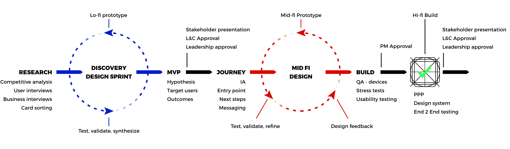
Low fidelity: Research & discovery
- Competitive analysis
- User Interviews
- Card Sorting
- Test lo-fi prototypes
- MVP
- Target users
- Hypothesis
Mid fidelity: User Flow & journey
- User journey
- User flow
- Test, validate and build mid-fi designs
- Design feedback
- Messaging
- Business requirements
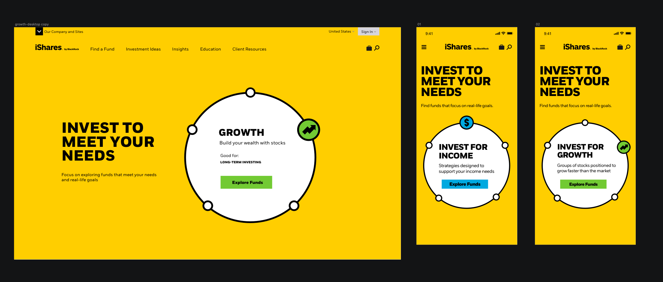
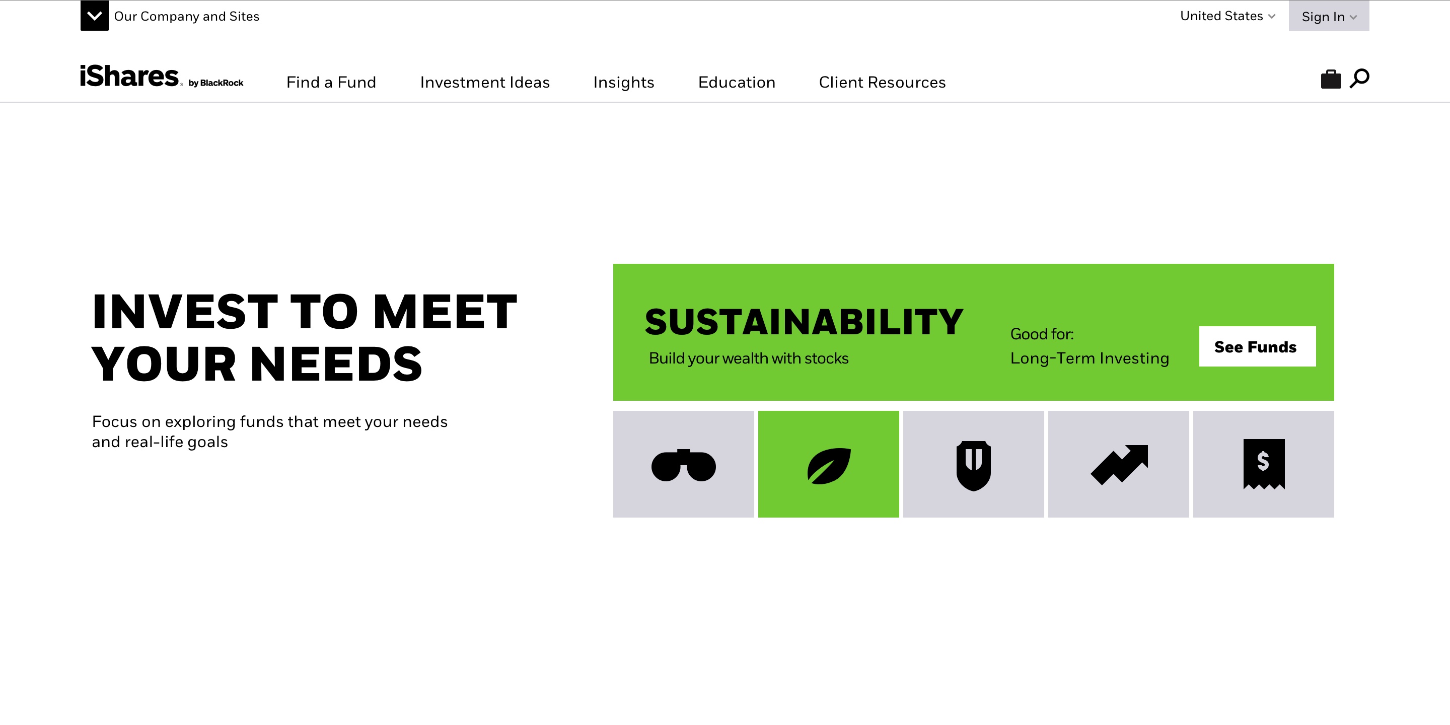
High fidelity: Pixel perfect implementation
- Implement design system patterns
- Implement extra accessibility standards
- Final approvals
- Final QA testing
Assitive tech compatible
This was the first tool within our digital ecosystem where we really wanted to focus on being inclusive to all users, regardless of temporary or permanent disability.
Challenges & findings
- No company-wide accessibility standard or dedicated QA team
- Meet AA compliance, WCAG 2.1 Guidelines
- User should be able to navigate tool using only a keyboard
- The content hierarchy should be predictable, and provide cues to assist the user's journey
- Every interaction should make sense to the user
- Manual test with screen readers, such as VoiceOver, TalkBack and other mobile assistive tech
- Automated test with Axe

Other Info
Duration: Six months (April 2019 - October 2019)
Structure
- Three Designers (SF)
- One Project Manager (SF)
- Five Developers (BUD)
- Leadership (LDN)
Workflow
- Two week sprints
- Design one sprint ahead
- Lo/mid/hi-fi iterations
- Designers QA (if none available)
- Demo to stakeholders
- Retrospective
Tools
- White boards
- Sketch
- Abstract
- InVision
- jsfiddle
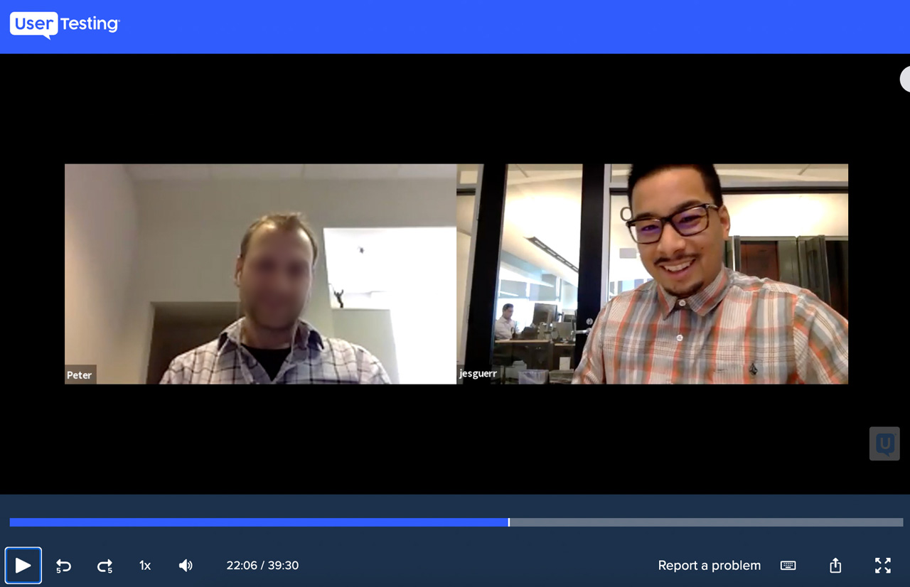
- Usertesting.com
- Optimum Workshop (card sorting)
Management & organization
- JIRA
- Airtable
- Miro