New Visual Identity, same audience
We had just been given a brand new Visual Identity to work with, which was a completely different look and feel from the current one. This came with the expectation that the change would be abrupt, there would be a period of adapting for our current users. This also gave us a great opportunity to identify interactions to maintain as well as areas of opportunity.
Opportunities
- Make funds selectable
- Improve filtering patterns
- Implement a mobile optimized design
- Serve as a central tool within iShares digital product ecosystem
Challenges
- Where do we start?
- How do we test?
- How do we work with L&C to explore boundaries?
- What will the user task workflow look like?
- How do we deliver?
How do we use this new brand?
From color, layout, and typography to users’ patterns and behaviors on this tool, there was a ton of exploration needed to help uncover areas for improvement.
UX
- Data consumption
- User journeys to/from tool
- Improve a tool that users are familiar with
- Preference vs competitor tools
VI
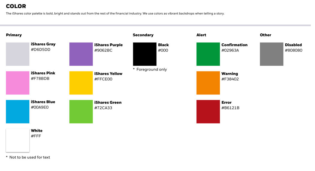
- Explore how brand colors work with data
- Test the effect of brand application
- Create a visual connection to other tools within the ecosystem
Challenges
- Brand new VI, no previous instances of products with new brand
- Minimal VI guidance for digital products
- Limited design team
- Introduce drastic change to existing users
Learning about our users
This tool is very complex and has a broad user base. We needed to understand the users' financial research behaviors and expectations from product screeners. We explored different testing methods to better understand how this screener works into the user workflow.
Strategy
- Effective Timing - Language and regional barriers
- Write tasks to get users talking
- How to synthesize findings in order to inform our design solutions
Methods
- User interviews - Investors and Advisors
- Usability testing - Us and competitors
- Qualitative A/B Testing
Findings
- Users need to get to their data as fast as possible
- Design shouldn't get in the way or be noticed
- Users will likely use the input field to find funds rather than filters
- Users would likely be using other tools simultaneously with this screener while conducting research, such as Bloomberg or Morningstar
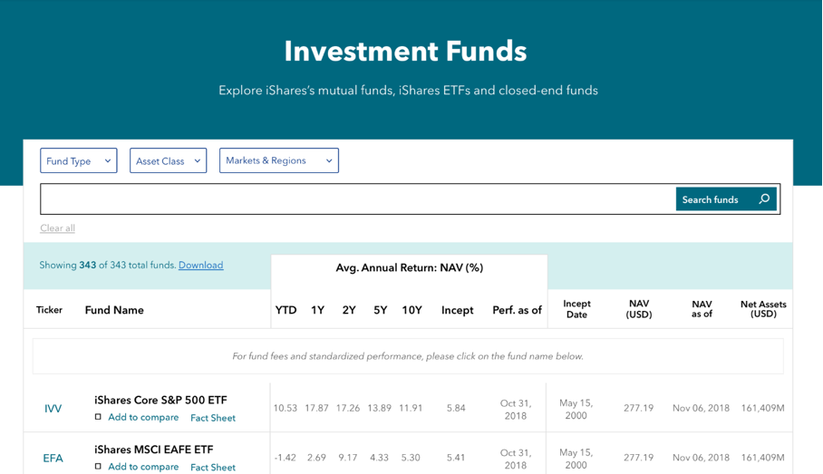
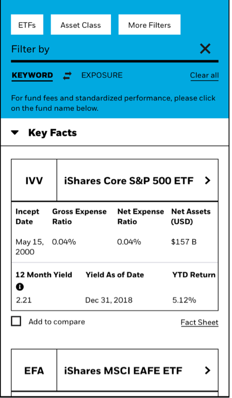
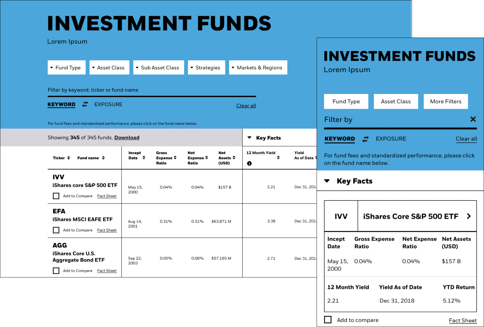
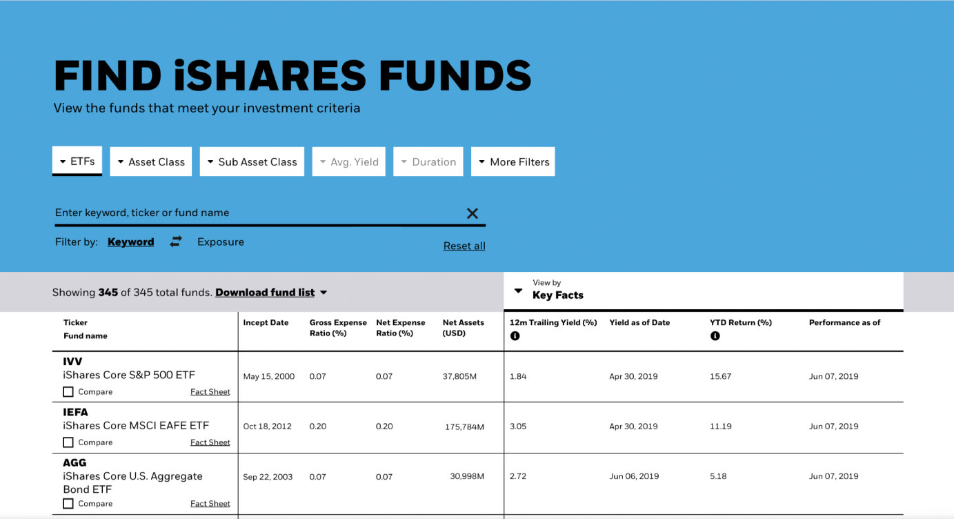
Tons of data, not enough screen
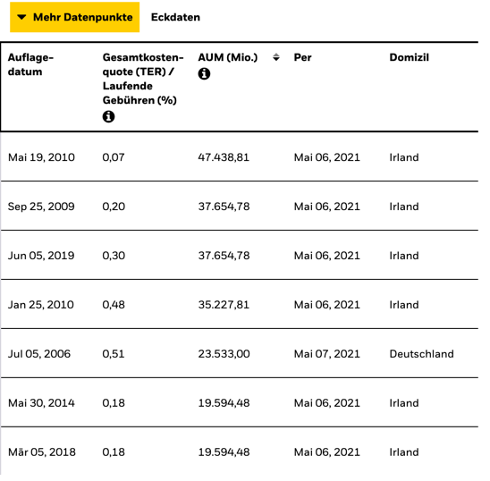
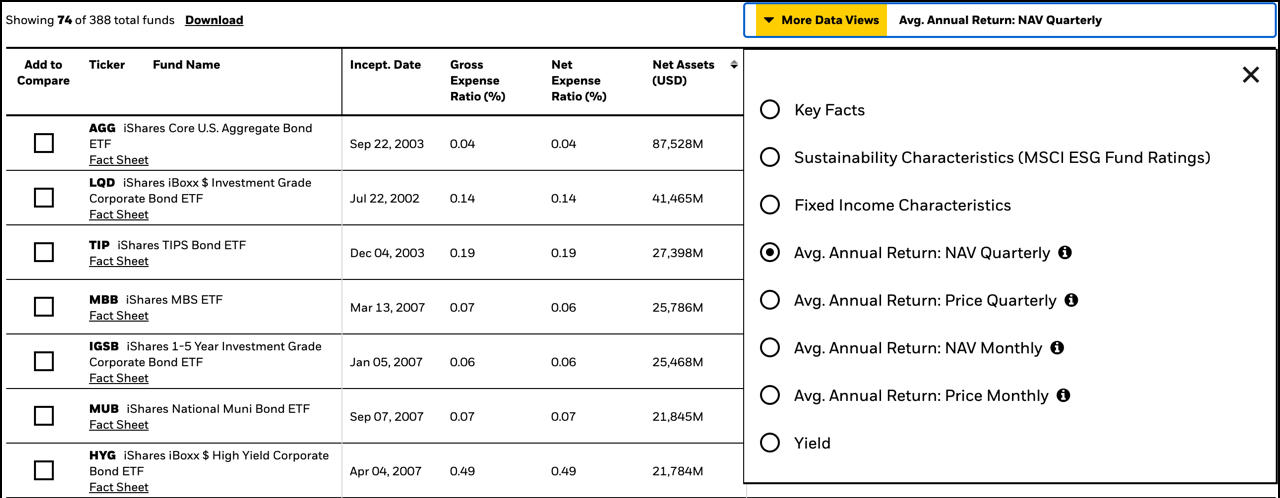
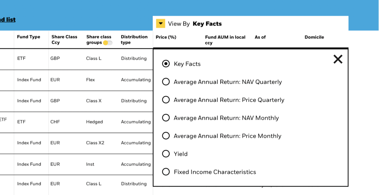
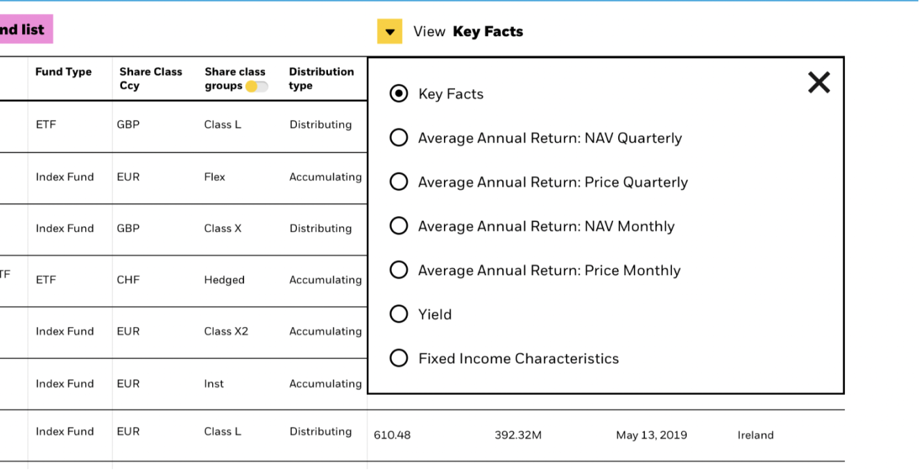
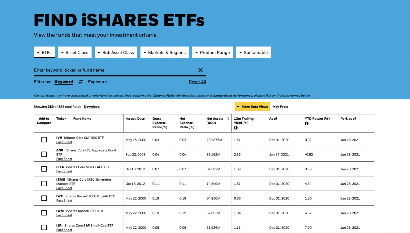
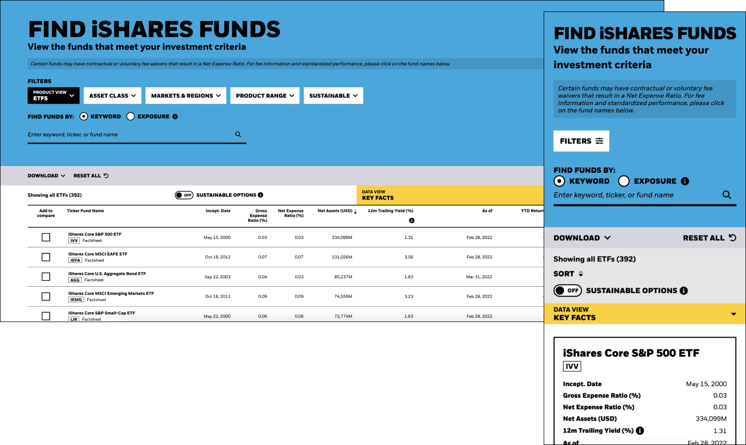
This screener would display almost every detail about each product, however we had a very limited amount of space to work with, so connecting users to all this data was quite a problem to solve. On top of that we had L&C challenges as to how data gets displayed.
Challenges
- The data is displayed in groups / buckets
- Maximize real estate while without sacrificing readability
- Narrowing down large data sets
- Scalability to longer translations, such as Germany
- Scalability to different types of data setsm such as the UK
- Legal & Compliance limits and rules
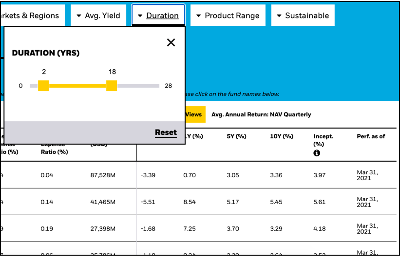
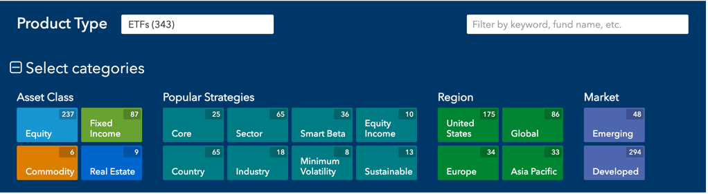
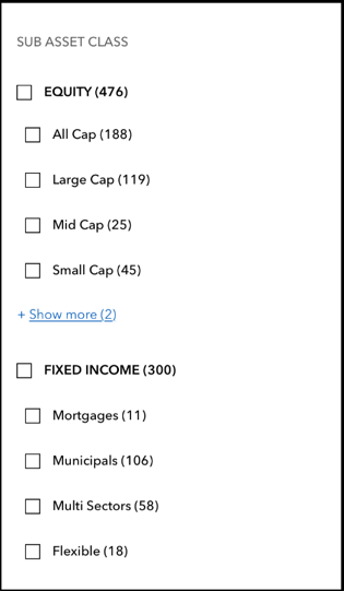
Narrowing down the data
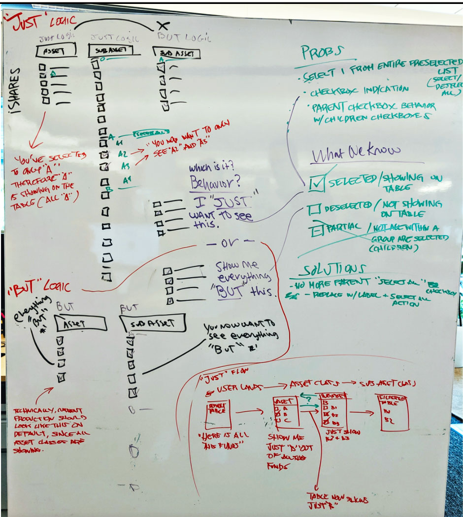
Establishing the filtering logic for checkbox interactions was one of the toughest challenges. Our solution would also have to be scalable for future implementations across the firm (BlackRock and Aladdin tools), not just for the iShares tool suite.
Problems
- Select one filter from entire preselected group of filters (selected/deselected). What should the checkbox be?
- Checkbox indication states- what are we telling the user?
- Parent checkbox behavior with children checkboxes
- Only Asset Class and Sub Asset Class talk to each other and there is no indication to the user of this behavior.
Solutions
- Abandon parent checkboxes / parent selections
- Replace parent selections with labels
- Add toggle option to select/deselect all within a group
- No preselections - give user control to add just what they want
- These solution eliminate the need for partial state checkboxes
Findings
- "Just" Logic: Give the users control to see just what they want, reflected by a selected state checkbox and no preselected groups.
- "But" Logic: Preselects all within a group and the user decides which one(s) they don't want to see. "Everything but..."
Ideation
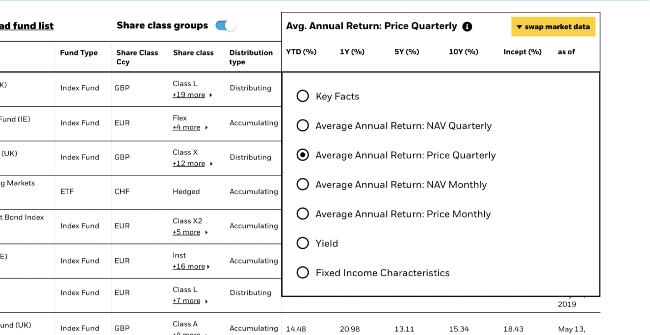
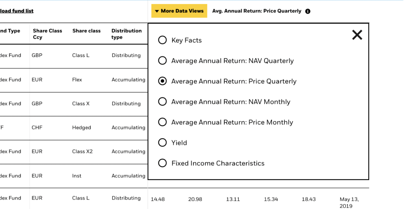
Swapping data sets
We were required to display all data for all funds available to the user despite the limited space. To solve this problem, we needed to find a solution which allows the user to select sets of data they would like to see. This solution should not only be discoverable, but make sense and most importantly- easy to read.
Test strategy
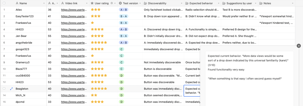
- We started with one general idea based on a previous solution, and iterated based on user feedback.
- Tested with six users per iteration, and iterated until we received at least 80% positive feedback on usability
- Users span different age groups from 30 to 65+
Themes
- Language / messaging: This would be key to expected functionality
- Positioning: This is key for dicoverability and focus
- Visual Design: The interaction should catch the user's eye, but not disrupt the user's tasks
Insights / findings
- The word "data" with a subsequent verb would give the user an accurate expectation to the interaction
- The menu title works best to the right of the button itself
- Version "D" is the preferred solution
What to do with these products?
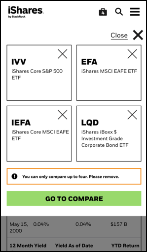
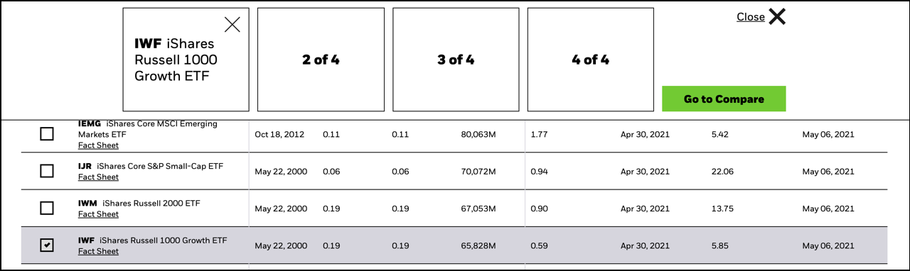
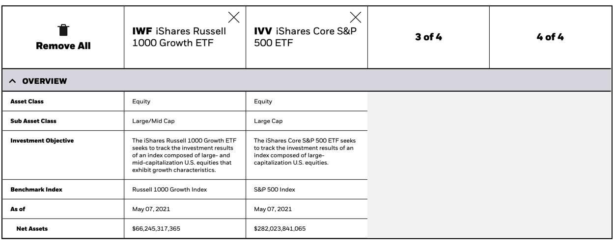
Users' financial research shoudln't end here. In order to ensure we are giving the users enough information to feel confident in their decisions, we wanted to give them the ability to collect ETFs and compare them in a separate, but connected tool.
Challenges
- What will be the most effective user selection patterns?
- How will the user discover the basket and compare tool?
- How will the user maintain their thought process with minimal disruption?
- How can this basket function be complimentary to the overall experience?
Findings
- Checkboxes are common for multiple selections
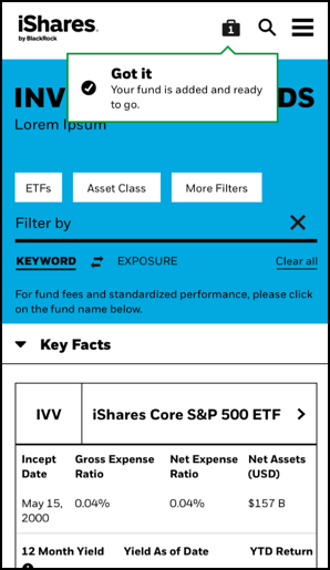
- A "cart" feature, similar to an e-commerce site is a familiar pattern and gives the users ability to store selections
- Animating in the basket upon first user selection was effective in discovery
- Each subsequent selection will trigger a confirmation message
Iterations
This tool went through multiple launches improving on the design from its first release to how it is today. In order to keep up with new user feedback and evolving technology, multiple regular releases are necessary.
Key improvements throughout
- Condensed data: We found ways to make better use of the available real estate and improved the whitespace balance
- Leveraged an improved grid system to allow more felxibility with data layout
- Improved data swapping interaction based on rigorous user testing
- Mobile layout for filters and fund data
Improvements in the backlog
- Improve input field for search and filter
- Add features such as "recently viewed"
My role
I was part of a cross - region Product Design team that spanned San Francisco, New York, and Budapest. Each Designer worked on UI and UX, with more focus on specific areas. My focus was on UX and was the SME for User Research while also working on UI. We had one Sr. Designer in New York, who oversaw work in SF and Budapest who came in halfway through the project, while I lead the efforts locally. I was also the main contact for developers for specifications and interactions, and worked alongside Project Managers to write and define stories.
Other info
Duration: ongoing (April 2019 - present)
First release
- 1.5 Designers (SF)
- Two Project Managers
- Five Developers
- One QA
Second / third release
- Three Designers (SF / BUD)
- Two language translations
- Three Project Managers (SF / LDN)
- Eight Developers
Currently
- Three Designers (SF / BUD / LDN)
- Three language translations
- One Project Manager (LDN)
- Eight+ Developers
Workflow
- Two week sprints
- Design one sprint ahead
- Lo/mid/hi-fi iterations
- Designers QA (if none available)
- Stakeholders demo
- Retrospective
Design & Testing tools
- White boards
- Figma
- Sketch
- Zeplin / Abstract
- InVision
- jsfiddle
- Usertesting.com
Management
- JIRA
- Airtable
- Miro